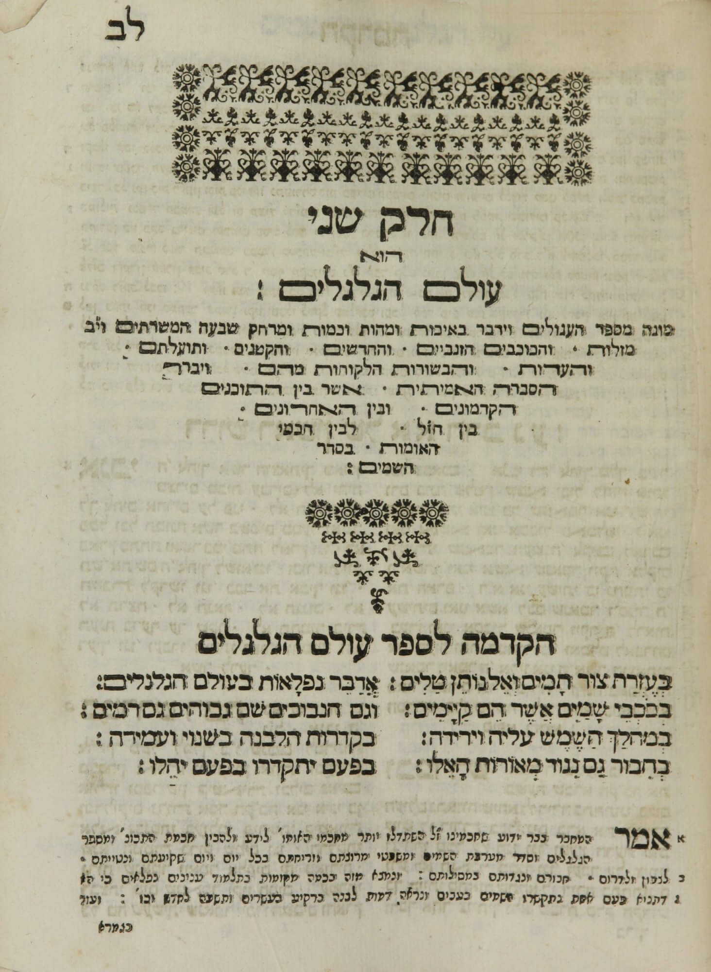
Kats, Ma’aseh Toviyah, 1708 (8.4r)

This decorative chapter title showcases several sizes and weights of Hebrew type. The use of both elongated and regular forms of several letters, including ה (he), ת (tav), and ם (final mem), is particularly visible in the triangle of text at the top of the page. Stretching letters with horizontal lines was a common convention in Hebrew printing used to justify lines.

This decorative chapter title showcases several sizes and weights of Hebrew type. The use of both elongated and regular forms of several letters, including ה (he), ת (tav), and ם (final mem), is particularly visible in the triangle of text at the top of the page. Stretching letters with horizontal lines was a common convention in Hebrew printing used to justify lines.

open image or download from source: NLM

Toviyah Kats, Ma’aseh Toviyah. Venice: Stamparia Bragadina, 1708. (sig. 8.4r)

U.S. National Library of Medicine, WZ 260 K187m 1708 (copy 1) (public domain)
  • written by Colette Calegari
  • thanks to to Michelle (Chesner) Margolis for assistance with the Hebrew typography