Skip to content

Early Printed Books

resources for learning and teaching

  • About
    • Contributors
    • Permissions &c
    • Privacy
    • FAQ
    • Contact
    • Changelog
  • Get Started
  • Browse Images
    • Browse Tags
    • Search the Site
  • Resources
  • The Book
    • Errata List
  • Featured Content

library: Folger Shakespeare Library

Folger Shakespeare Library (USA)

Bible, Polyglot, 1657 (T1v)

An example of a "polyglot" Bible---a Bible printed in its earliest languages and translations. On this leaf you can see texts in Hebrew, Latin, Greek, and Syriac, each in their own place and separated by hand-drawn red ruling.

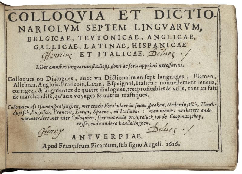
Colloques ou dialogues, 1616 (A1r)

The title page for this multi-lingual phrasebook repeats the title three times, once in each of the languages predominant in Antwerp.

Colloques ou dialogues, 1616 (A4v-A5r)

The odd shape of this book (little and oblong) comes from its contents (seven columns of dialogues in different languages) and its use (a pocket-sized volume for travelers).

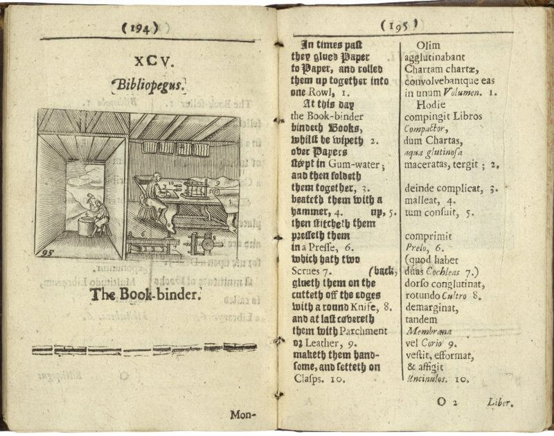
Comenius, Orbis, 1685 (O1v-O2r)

This opening from a popular Latin textbook uses different typefaces to set apart the English and Latin phrases and to call attention to the vocabulary words that are illustrated on the facing page.

Donne, Juvenilia, 1633 (F1v, raking light)

Imaged under a raking light, this blank page reveals a great deal more texture than images usually do, including wrinkled (or cockled) paper, vertical wire lines, the bite of type as it pushes out the paper from the other side, and the bite into the paper from some uninked (or blind) type in the middle of the page ("These eleven Paradoxes"). Some copies of this edition have this imprimatur inked and legible; others, like this one, seem not to have included it, although the type was clearly left in the forme even if it didn't print. (Compare this image to the one under usual flat lighting to see how different lighting shapes what we see.)

Donne, Juvenilia, 1633 (F1v)

This blank page is surprisingly busy. There's ink bleeding through from the other side (you can see the running title "PARADOXES" at the top and the signature mark "F" at the bottom of the page) but there's also offset from the facing page ("PROBLEMS", the title of the next section). It can sometimes be hard to tell the difference between bleed-through and offset in digital images if you can't also see the facing page, but one clue is to look for different colored ink. But if you look at this page under raking light, you'll see there's even more going on than is apparent in this image.

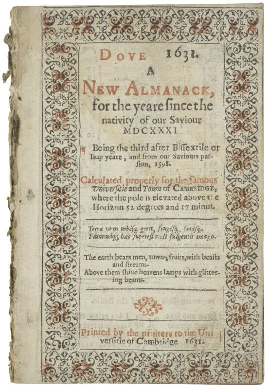
Dove, A new almanack, 1631 (A1r)

Since almanacs featured the location of astrological bodies, they were most accurate for specific geographical locations. This title page for Dove specifies that it is calculated for Cambridge. The use of red ink was typical for almanacs, both on the title page and in the content.

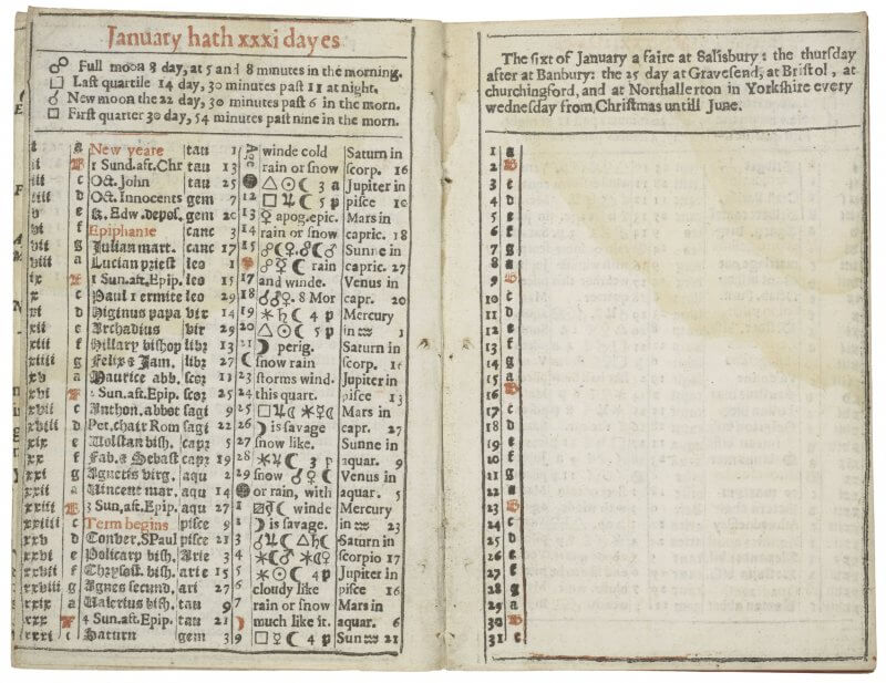
Dove, A new almanack, 1631 (A2v-A3r)

This almanac shows a typical combination of information: dates of the month, the dominical number, saints days and other festivals, the positions of various astrological features, and space for the user to write their own notes. But this almanac is atypical in that it survived---huge numbers of almanacs were printed, particularly in the 17th century, but most were discarded at the end of the year and lost to posterity.

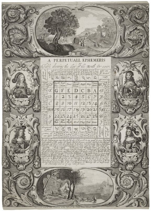
Faithorne, A perpetuall ephemeris (1655)

Although engraved and etched plates in books tend to be primarily of images, intaglio techniques can also be used to write text, as in this perpetual calendar. For more on how this calendar works, see Erin Blake's post "Happy New Year's E" in The Collation.

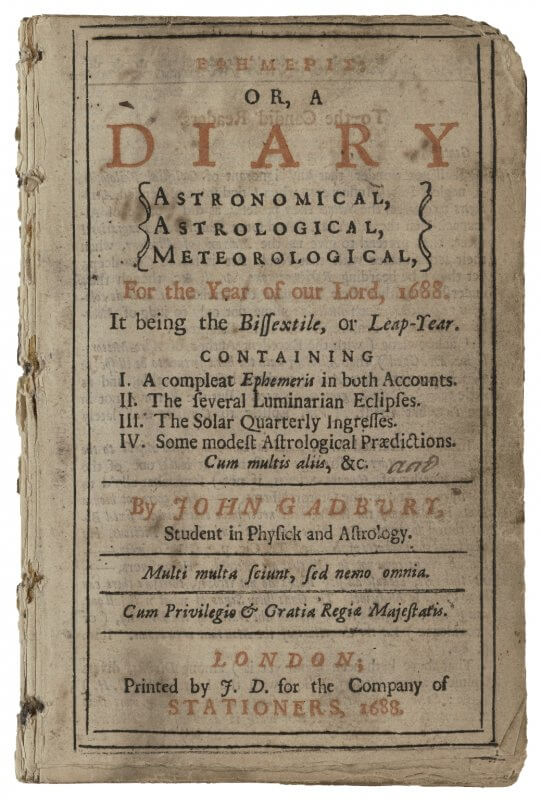
Gadbury, Ephemeris, 1688 (A1r)

This ephemeris---a calendar of astronomical positions---for the year 1688 uses red ink on the title page to highlight the key words advertising this work.

Posts navigation

Page 1 Page 2 Page 3 Next page

browsing

Browse by going through all the images or all the tags, or by following the main tags below. To learn more about what the various features mean, click on the tag and read the description at the top of the page.

main printed features

  • advertisement
  • blank
  • book making
  • colophon
  • correction
  • error
  • form
  • frontispiece
  • imprimatur
  • index
  • initial letter
  • intaglio
  • movable parts
  • music
  • press figure
  • printed marginalia
  • printer's device
  • printer's ornament
  • privilege
  • register
  • signature mark
  • subscribers list
  • title page
  • two-color printing
  • woodcut

date published

  • 1450-1499
  • 1500-1549
  • 1550-1599
  • 1600-1649
  • 1650-1699
  • 1700-1749
  • 1750-1800

place printed

  • Belgium
  • Czech Republic
  • England
  • France
  • Germany
  • Italy
  • Mexico
  • Netherlands
  • Peru
  • Poland
  • Russia
  • Scotland
  • Spain
  • Switzerland
  • Ukraine
  • United States
Sarah Werner. "library: Folger Shakespeare Library." Early Printed Books. https://www.earlyprintedbooks.com/library/folger/. Version 20190314.
Creative Commons License
Early Printed Books is licensed under a Creative Commons Attribution-NonCommercial 4.0 International License unless otherwise stated. For more information, see Permissions.