Skip to content

Early Printed Books

resources for learning and teaching

  • About
    • Contributors
    • Permissions &c
    • Privacy
    • FAQ
    • Contact
    • Changelog
  • Get Started
  • Browse Images
    • Browse Tags
    • Search the Site
  • Resources
  • The Book
    • Errata List
  • Featured Content

misc: roman

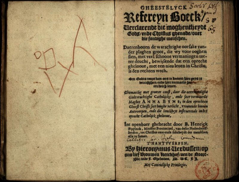
Bijns, Refereyn, 1611 (A1r)

This lengthy title page provides the author's name, imprint and privilege statements, and a description of the book's contents.

Black Bird, 1790 (p1)

The title page to this small chapbook lists the 8 ballads printed therein along with a decorative woodcut.

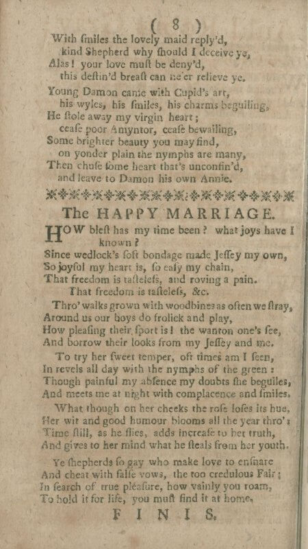
Black Bird, 1790 (p8)

A line of printer's flowers is used to separate the end of one ballad from the start of the next in this 8-page chapbook; because this is the last page, the phrase finis is placed at the end.

Catalogue of the Faculty of Advocates, 1742 (K1r)

This was a working catalog for the Advocates' library, and the shelfmarks for the books were added and updated throughout its active life.

Catalogue of the Faculty of Advocates, 1742 (π1r)

The Advocates' Library kept a collection of books (law and otherwise) since the Faculty's inauguration in 1689. This series was the third such catalog of books in the library, and as can be seen in the interior pages, was used to record not only the acquisition of books, but their changing shelfmarks.

Cato, Moral distichs, 1735 (A1r)

Although it's placed where one might expect a printer's device, the design on this title page is a combination of printer's flowers, rather than a device intended to identify the printer.

Colloques ou dialogues, 1616 (A1r)

The title page for this multi-lingual phrasebook repeats the title three times, once in each of the languages predominant in Antwerp.

Colloques ou dialogues, 1616 (A4v-A5r)

The odd shape of this book (little and oblong) comes from its contents (seven columns of dialogues in different languages) and its use (a pocket-sized volume for travelers).

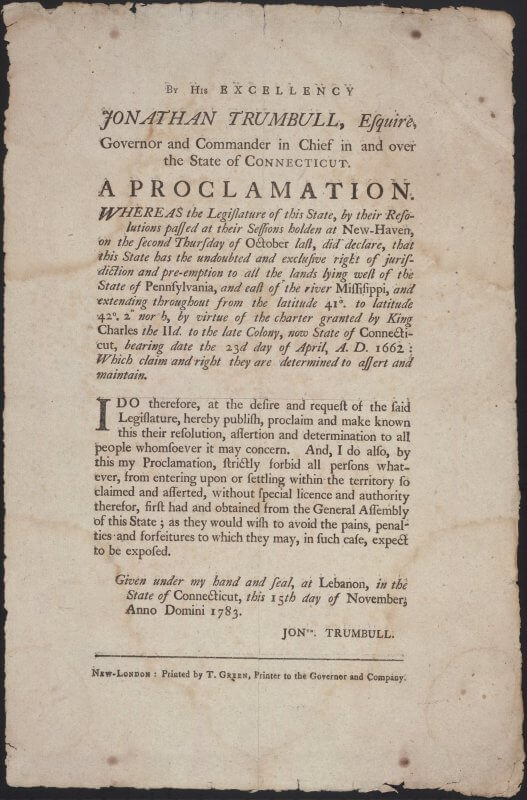
Connecticut, Proclamation, 1783

If you look closely at this broadside, you might see that the text at the top and bottom have light shadows---a faint double impression caused by an accidental bounce of the paper on the inked type

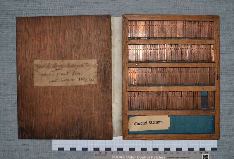
Coronelle Romaine, matrices

These are matrices---the pieces of copper that are the molds used to produce pieces of type---used for the typeface Coronelle Romaine. If you zoom in, you can see the nicks at the bottom of the matrices used to orient them in the mold and the individual letter forms, as well as ligatures (joined letters), numbers, and assorted other characters. Stamps made to illustrate this typeface can be seen here.

Posts navigation

Previous page Page 1 Page 2 Page 3 Page 4 … Page 11 Next page

browsing

Browse by going through all the images or all the tags, or by following the main tags below. To learn more about what the various features mean, click on the tag and read the description at the top of the page.

main printed features

  • advertisement
  • blank
  • book making
  • colophon
  • correction
  • error
  • form
  • frontispiece
  • imprimatur
  • index
  • initial letter
  • intaglio
  • movable parts
  • music
  • press figure
  • printed marginalia
  • printer's device
  • printer's ornament
  • privilege
  • register
  • signature mark
  • subscribers list
  • title page
  • two-color printing
  • woodcut

date published

  • 1450-1499
  • 1500-1549
  • 1550-1599
  • 1600-1649
  • 1650-1699
  • 1700-1749
  • 1750-1800

place printed

  • Belgium
  • Czech Republic
  • England
  • France
  • Germany
  • Italy
  • Mexico
  • Netherlands
  • Peru
  • Poland
  • Russia
  • Scotland
  • Spain
  • Switzerland
  • Ukraine
  • United States
Sarah Werner. "misc: roman." Early Printed Books. https://www.earlyprintedbooks.com/misc/roman/. Version 20190427.
Creative Commons License
Early Printed Books is licensed under a Creative Commons Attribution-NonCommercial 4.0 International License unless otherwise stated. For more information, see Permissions.